Sep 282010
{click image to view large}
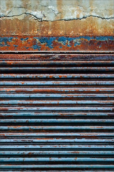
The graphic lines and complementary colors of blue and orange attracted me to this subject in an alley.
It might look well printed on metallic paper, and tie into the series of doors I photographed awhile back in the catacombs of Savannah.
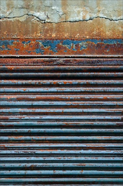
Edit October 2, 2010: I replaced the original image with another, attempting to bring out more color and contrast. Following is version 1 for comparison—change is more obvious in the larger versions:
●●●
Nikon D300; f/6.7 @ 1/125sec, ISO 3200 (handheld);
18.0-200.0 mm f/3.5-5.6 @ 40mm (60mm EFL); subject distance 2.24m


Missed it.
Too late to answer tonight. I am not sure yet but I might prefer the original one. Perhaps because it reminds me old frescos in Italy (14th-15th century). I am writing about the top border or edging. What would you think about doing a square out of this original rectangular format?
See you later.
I really prefer version 1 for the reasons I gave yesterday, but also because the building materials look older, thus time or weather decay is more obvious. To my opinion, needless to say.
Knowing why you took this picture, I understand your choice, though.
I love your reference to frescos, Micheline. In that context, and given the original nature of the subject, I agree the first variation is a better rendition. It is what it is! In contrast to a desire to “wow”, subtlety is much more authentic in this case.
Your insights are always a pleasure to receive.
“What would you think about doing a square out of this original rectangular format?”
On your suggestion, I did re-visit that possibility. In the square, my feeling is that the top has a lot of weight without enough support below. Should we read left-to-right or top-to-bottom? Movement is lacking, and it becomes (even more) static for me.
I should post that variation for comparison…but got lazy. 🙂
Square: You are right and I trust your eye.
The vivid picture is very interesting too. The colors at the top of the image seem to be spilling over the corrugated iron wall. Colors are like musical contrapuntal theme.*
* Orange and blue in counterpoint to cyan.
I went to see the series of metallic doors . Merveilleux! Beautiful colors.
“I went to see the series of metallic doors . Merveilleux! Beautiful colors.”
That was a very fun morning of discovery after the conclusion of the Next Step workshop. 🙂
Also my first foray into printing on metallic paper. Two of those actually sold!