Aug 092010
—
—
{click an image to view large or start a slide show}
Over on Flickr, Micheline asked “How come we do not see [these images] on your blog?” In part, it’s because I wasn’t sure what I thought of them.
The scenes struck me as poignant… People who don’t have much still find ways to introduce beauty and pleasure into their lives: a gentle sound, bright color, blooming flowers, a day at the beach. I’d love to know if that comes across for you in these images, or not!


Well it most certainly does!
As I looked at these images, I wondered, for instance, why you didn’t choose to boost up the contrast on the wall in image 2 and make it look a little more pleasing. Similarly, why include the edge of the wall on the right in the 3rd image.
Then I understood why.
I would love to see you write more about your pictures. You have the ability to narrate photographs in words, which is very rare.
April, you are indeed trying new things, compositions, subjects for your camera and your own eye. I like these images, too.
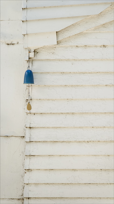
I wouldn’t have gotten the message “Simple Pleasure” from the first one, tho. It’s a little bell hanging on very dirty and drab blinds or shutters. I would have thought you were finding objects that had been forgotten, left behind. But with the title “Simple Pleasures,” now I understand that even tho the lives of the people who had to look at those blinds/shutters were drab, that little tingling bell must have given them pleasures.
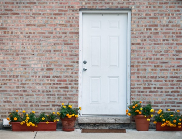
The flower pots beside the plain white door in the middle of the brick wall do convey simple pleasures to me – plants with flowers aren’t very expensive, but they certainly reward their owners and visitors with great, if simple, treasures.
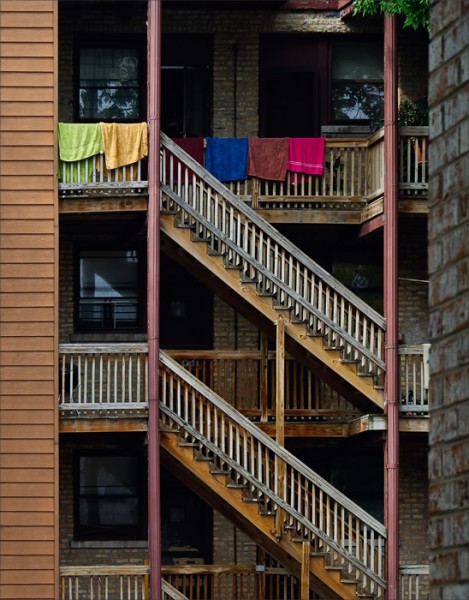
n apartment near the beach – the colorful towels draped over the railing to dry after a swim show another example of simple pleasures – but only if we know this is at the beach! Otherwise, from the condition of the wooden railings, we might conclude that the people who live there have lives of very little color – except the color of those towels.
But as a series with the title “Simple Pleasures” these are great images.
Hi April, This is a wonderful series! The two words that immediately came to mind were: simple and elegant. This was followed by thoughts about how sound and color can brighten otherwise drab environments. Your narrative then guided me further down this line of thinking. I thoroughly enjoyed the journey!
I love how you compose with color, April. This is the first time I have seen your photos but I have had a quick look through your recent pictures and you do a marvelous job with colors. Your photos are very satisfying to look at–they feel complete and assured, somehow, but without the strutting pretension that dominates most pictures I see online (and probably those that I publish myself).
I love this series, April. I understand your intent now. It is well thought but not evident /obvious at first sight. If you entitle this series: Simple Pleasures And People, would it be better? Or you capture more and more pictures on this subject to lead your viewer where you want to. En Fançais, je dirais: “Au plaisir des gens “. I am talking in French now… My God! I will be back soon.
Or ” “Simples plaisirs pour tous” or…or…
Thank you very much for your feedback, everyone. I appreciate your comments!
Micheline, I’m going to keep my eyes open for more opportunities and see if this series develops. I agree that a larger selection of pictures would help clarify the theme — for the viewer, and for me!
Aaaah…the first one is exquisite
Pixelle2008 (il y a 2 semaines in Flicker) NO 002
Très intéressante la récurrence du thème de la porte. S’agit-il encore du thème de l’intimité (privacy) comme dans la photo du placard aux robes de nuit? Ici de l’intimité protégée, mais tout de même révélatrice des habitants de la maison: le plaisir des fleurs.
Les couleurs discrètes de la façade soulignent la vivacité des fleurs qui décorent le seuil de l’entrée. J’aime beaucoup l’opposition froid/chaud dans cette photo (teintes bleutées des murs, de la porte, du trottoir versus celles très chaudes, rouges, orangers, jaunes, des pots et des fleurs).
April, j’aime la simplicité du point de vue (POV) de cette photo prise sans artifices ni recherche d’effets. L’été dans la ville, plaisir des fleurs.
Pixelle2008 (il y a 2 semaines on Flickr) No 003
April, ,
La symétrie des lignes (horizontales, verticales et diagonales) et leur répétition mettent en valeur l’aspect graphique de cette image. Les différentes textures soulignent non seulement les différents matériaux de construction de l’édifice, mais également son âge.
Les dominantes jaune-beige, gris et rouille contribuent à l’unité et à l’harmonie de l’ensemble. La vivacité, apportée par la couleur des serviettes de bain, rappelle la plage dont il est fait mention dans le titre, et ajoute un trait événementiel à cette photo d’architecture: la vie quotidienne des habitants de cet appartement.
Bravo, April, une photo très vivante et qui retient longuement le regard et l’attention du spectateur.
P.-S. Sans compter le plaisir de la lumière.
April,
I’ll translate it for you later. I was on a rush and did not want you to believe that I have forgotten your work.
No 001
I love this blue note with a yellow-gold accent on white and yellowish textured background.
It is personal but BLUE NOTE reminds me Chicago and the Jazz bars.
I have loved that town of my youth… so as the music.
“Blue Note” strikes me as a perfect title for the first image…suggestive of the sound, musical notation on a staff (graphically), the Chicago setting, and a hint of sadness.
Micheline, I’m grateful for the time you take to visit and offer such insightful comments—even when you are holiday! It is no trouble to translate, and learn a bit more French. 🙂
I’ll post more in response to your feedback, but for now did want to extend my thanks!
Quoting Micheline (in translation) re No2: “Very interesting the recurrent theme of the door. Is it still the subject of privacy (privacy) as pictured in the cupboard nightgowns? Here privacy protected, but still indicative of the inhabitants of the house: enjoy the flowers.”
There is, for me, a feeling of seeing through the door into the lives of people who live behind it.
And in translation for No3: “…the daily lives of residents of this apartment.”
One direction I want to take is away from the graphic into images which have more…life! Though I can’t try to become someone else and see differently, perhaps I can work to see more deeply or connect more directly—even in the city, surrounded by man-made structures, where people naturally try to protect (hide) themselves.
quote April: ” One direction I want to take is away from the graphic into images which have more…life! Though I can’t try to become someone else and see differently… ”
To my opinion, your graphical images are as lively as a huge scenic landscape. Both have its own way to deal with beauty of life, pleasure and feeling. In English, you say STILL LIFE; in French, we say NATURE MORTE (literally: dead nature, dead element). I prefer the English reference to life than the French one to death.
” Though I can’t try to become someone else and see differently… ” April
Please do not. If you do, I’ll follow you.
You’ve sparked a fresh train of thought, Micheline; thank you! I’ve always associated “still life” with the classical subjects of paintings or, as you mentioned, “nature morte.” But I had not considered a literal reference to “stillness in life”.
A sense of quiet, or space. Time to appreciate details such as the fall of light, rich textures, brilliant hues, or flow of line—all classic elements of still life.
And in exploration, I wouldn’t have to abandon my natural tendencies. 🙂 Only keep pushing to convey the quality of life…